Thursday, March 3, 2011

Project 5: Residence for an Artist

The latest project was a three week sprint to design a house for an artist (we decide the type of artist). The artist's studio is directly adjacent to our site, and we were to design a connection from the house to the studio. The site is bordered by an old factory on one side and a mountainous landscape on the other.


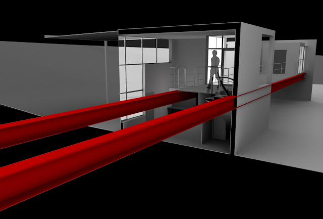
My artist creates installations that bring out the good in people, and his art wouldn't be considered art if people didn't interact with it. He (hypothetically) is moving to State College from Alaska because he feels that there isn't enough audience/participants for his art and the harsh weather hinders his changes to get his installations into the public, so I thought of implementing a sort of outdoor "stage" element because he wanted to have more exposure. This transformed into the bridge that is highlighted throughout my renders. Also, I decided to remove the artist's personal study from the main house because then he can interact with both sides of the site while traversing the bridge to and from it.


My design started off as very functional, which is reacting to the level of functionality that a factory requires. In order to address the dual-nature of the site,


Here's the final product (animation links at the very end):


 ANIMATIONS: http://www.youtube.com/watch?v=YXj49-P-1P8
                               http://www.youtube.com/watch?v=UBoI7Ji1zvg

Monday, February 7, 2011

End of Digital Rotation

So, for the past rotation, I've been learning about digital modeling programs, and in my spare time, I've been learning more about rendering as well. Pretty enjoyable, and here is what I've done:


First Project: Folded shape


Second project [Bionicle piece] (1/3): digital model:

Second project [Bionicle piece] (2/3): digital model:
Second project [Bionicle piece] (2/3): 3-D printed model:

Second project [Bionicle piece] (3/3): digital model:
Second project [Bionicle piece] (3/3): 3-D printed model:


 Third project: combine mine and other people's Bionicle parts to create a craft of some sort, and show it traveling through a medium of some sort.


Tuesday, January 18, 2011

Second Semester, Second Year start

This semester opened up with my digital rotation in studio. This rotation is to give students good exposure to a couple powerful 3-D modeling programs, namely Maya and Rhino. So far, we've done some introductory work in Maya just to get us used to the commands and tools available. On the side, I used my model of a steel connection that I did for materials class, and brought that into Maya in order to do a short animation of how all the parts go together (I apologize for the terrible video quality, the original video file looks much better!):


And for materials, the final connection drawing is below:

Monday, December 13, 2010

ePortfolio site updated

For now, I'm not posting images of the project I just completed, but I'll refer you to my ePortfolio site which I just gave a major update to: chrispeterson.weebly.com. I added a "Penn State Projects" tab and I updated each of the other tabs as well. The project I just completed is there, but I still may upload images to this in a later post.

Friday, November 12, 2010

End of Second Project

The second project was much larger in scale than the first, with a building footprint of 4,000 square feet. It was a five week project, and I used AutoCAD Architecture for drafting and 3-D modeling, which I had very minor exposure to previous to this project. I plan to create more renderings of the building, as I didn't have much time to go in-depth with the rendering capabilities of AutoCAD.

The project was to design a residence for visiting Penn State scholars to stay in. The program included a gallery space, library, cafe, eight suites, lounge, and a seminar/lecture space. It also was required that the entire building and at least four suites be ADA-compliant for people with disabilities, but I managed to work all eight suites to being compliant without much trouble.

The site was very awkward because of how thin it was, so it was a challenge to avoid creating awkward spaces in such a narrow area.

Here are a few slides that I used in my presentation:

Site Plan


I used the first, third, and roof plans in the upper right and carried them throughout the presentation to reference the section cuts to and to display where the interior renderings were shot from.

A major feature that I centered my design around was the lightwells that each suite was included with. In plan, these are the clusters of four rectangles. You can see these in section, as they are the two clusters of multiple rectangles. Each lightwell serves as a small personal courtyard, and it is open to the sky.

This section cut goes right through suite 3's lightwell. You can see it extends all the way through the building and is open to the sky. There is frosted glass preventing everyone else from looking into the space.


View from the main entrance inward: you can see all the way up to the third floor through the gaps in the above hallways. The cafe is on the other side of the glass, and the wood flooring denotes the gallery space, which extends to the basement.

This is a view down one of the corridors to suites 7 and 8 on the third floor, and you can see down to the first floor main entrance, which is where the previous rendering was shot from.

This is looking at suite 1's lightwell. Since it is on the second floor and there is a suite above it, you can see the glass block floor of suite 5's lightwell in the ceiling here. The individual lightwells are separated by frosted glass for privacy and also this enhances the amount of light bouncing around there.

I still want to do a few more renderings that explain these lightwells some more, but I'll put these up here for now. The next project will be four weeks, and that includes Thanksgiving break. It is a cafe and bookstore, and is a smaller-scale building than the scholar residence.

Tuesday, October 5, 2010

End of first project

The first project of second year was to design a jewelry store to be inserted into an existing space. Here are a few images of my final design:
Elevation photo with my design inserted.
Perspective photo with my design inserted.
Plan with the main store entrance at the top left.

Section showing the intended use of spaces.

Interior perspective looking towards the entrance.

Interior perspective on the mezzanine level looking across the opening.

This was the first time I integrated computer modeling in my design process. The model was created in Google SketchUp, then exported from there and imported into Autodesk Maya, which is a rendering program. Photoshop and Illustrator were used to create/modify the final presentation images, which included the ones shown above. It was a pretty short project, being only four weeks, and the next one is short as well. Unfortunately, this doesn't really allow for much time in the conceptual phase, which is a phase I would like to build more on.

Wednesday, September 1, 2010

End of Corbelletti Design Charrette

Right from the get-go so far, I've been quickly readjusting to the studio atmosphere. The Corbelletti competition has kept almost all architecture students up until the wee hours of the morning for the past couple nights. All in all, it was a very enjoyable project. Here is my final board:
I wasn't able to get a scan before the deadline, but I did get a photo off.

We got started on our studio project today as well, and the first project of the year is titled: Jewelry Store and Facade Insertion into an Existing Building. There are 12 students in my section this time around, and our professor had us split into four groups with specific tasks for examining and analyzing our site. Every student has the same location and the same project.