This is just a blog written by a Penn State architecture student. Started Tuesday, September 8, 2009, I hope to keep this going throughout my years here in Penn State and beyond that as well.
Monday, December 13, 2010
ePortfolio site updated
For now, I'm not posting images of the project I just completed, but I'll refer you to my ePortfolio site which I just gave a major update to: chrispeterson.weebly.com. I added a "Penn State Projects" tab and I updated each of the other tabs as well. The project I just completed is there, but I still may upload images to this in a later post.
Friday, November 12, 2010
End of Second Project
The second project was much larger in scale than the first, with a building footprint of 4,000 square feet. It was a five week project, and I used AutoCAD Architecture for drafting and 3-D modeling, which I had very minor exposure to previous to this project. I plan to create more renderings of the building, as I didn't have much time to go in-depth with the rendering capabilities of AutoCAD.
The project was to design a residence for visiting Penn State scholars to stay in. The program included a gallery space, library, cafe, eight suites, lounge, and a seminar/lecture space. It also was required that the entire building and at least four suites be ADA-compliant for people with disabilities, but I managed to work all eight suites to being compliant without much trouble.
The site was very awkward because of how thin it was, so it was a challenge to avoid creating awkward spaces in such a narrow area.
Here are a few slides that I used in my presentation:
I still want to do a few more renderings that explain these lightwells some more, but I'll put these up here for now. The next project will be four weeks, and that includes Thanksgiving break. It is a cafe and bookstore, and is a smaller-scale building than the scholar residence.
 |
| Site Plan |
 |
| I used the first, third, and roof plans in the upper right and carried them throughout the presentation to reference the section cuts to and to display where the interior renderings were shot from. |
 |
| This is a view down one of the corridors to suites 7 and 8 on the third floor, and you can see down to the first floor main entrance, which is where the previous rendering was shot from. |
I still want to do a few more renderings that explain these lightwells some more, but I'll put these up here for now. The next project will be four weeks, and that includes Thanksgiving break. It is a cafe and bookstore, and is a smaller-scale building than the scholar residence.
Tuesday, October 5, 2010
End of first project
The first project of second year was to design a jewelry store to be inserted into an existing space. Here are a few images of my final design:
 |
| Elevation photo with my design inserted. |
 |
| Perspective photo with my design inserted. |
 |
| Plan with the main store entrance at the top left. |
 |
| Section showing the intended use of spaces. |
 |
| Interior perspective looking towards the entrance. |
 |
| Interior perspective on the mezzanine level looking across the opening. |
This was the first time I integrated computer modeling in my design process. The model was created in Google SketchUp, then exported from there and imported into Autodesk Maya, which is a rendering program. Photoshop and Illustrator were used to create/modify the final presentation images, which included the ones shown above. It was a pretty short project, being only four weeks, and the next one is short as well. Unfortunately, this doesn't really allow for much time in the conceptual phase, which is a phase I would like to build more on.
Wednesday, September 1, 2010
End of Corbelletti Design Charrette
Right from the get-go so far, I've been quickly readjusting to the studio atmosphere. The Corbelletti competition has kept almost all architecture students up until the wee hours of the morning for the past couple nights. All in all, it was a very enjoyable project. Here is my final board:
I wasn't able to get a scan before the deadline, but I did get a photo off.
We got started on our studio project today as well, and the first project of the year is titled: Jewelry Store and Facade Insertion into an Existing Building. There are 12 students in my section this time around, and our professor had us split into four groups with specific tasks for examining and analyzing our site. Every student has the same location and the same project.
Monday, August 23, 2010
Penn State second year
The start of my second year at Penn State started today with a 10:00 Critical Thinking class. Studio is 1:25-5:30 Monday Wednesday Friday this semester, so there will be more in-class time for that.
The first project of the year will be the Corbelletti Design Competition which is a charrette for all second through fifth year architecture students to start off each year. It is almost entirely hand drawing-based, so it will be interesting to see where the other students' drawing skills are at.
The first project of the year will be the Corbelletti Design Competition which is a charrette for all second through fifth year architecture students to start off each year. It is almost entirely hand drawing-based, so it will be interesting to see where the other students' drawing skills are at.
Saturday, June 26, 2010
Midsummer
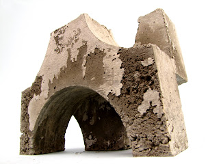
I realize it's been a very long time since I updated this, so here it is. I left off where the block group had cast its first prototype block to go into the Well House. Here are a couple photos of the final one:
So, there it is. There were dozens of these blocks cast out of 14 total formworks that were made such as this one:
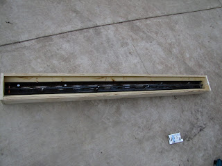
And since we were making the entire structure out of concrete, there were column and lintel formworks to be made:
And then, once these were constructed, we had to mix and pour concrete into them:
Then, after all that was done, here's what it looked like hanging out in the shop yard:
This was followed by the transportation of these blocks, columns, and lintels to the site:
So, after transporting everything to the site, we commenced construction:
All that was left at that point was some additional painting, plumbing, block additions, and site cleanup. Here are my final photos:


I'd call it a job well done by Penn State First Year Architecture, Section 3!
Monday, March 29, 2010
Well House process
The Well House previously mentioned is proceeding slowly it seems. Until now, we had narrowed our ideas for the water-catching roof and structural frame down to two, and our section just convened to create one idea. I am one of the three self-assigned to the "block crew." It's our job to create formwork for our concrete blocks that will fill in the frame. We successfully cast our first block:


It may not look/be perfect, but if you line them up in a staggered form, it looks pretty cool.
Here's what it would look like if they were all lined up in the staggered way, which is ultimately what they will be stacked as. The reason this image doesn't make perfect circles is because I had to warp the block a little in order to fit them in a nice pattern, but they are going to make near perfect circles in reality.
Subscribe to:
Comments (Atom)


